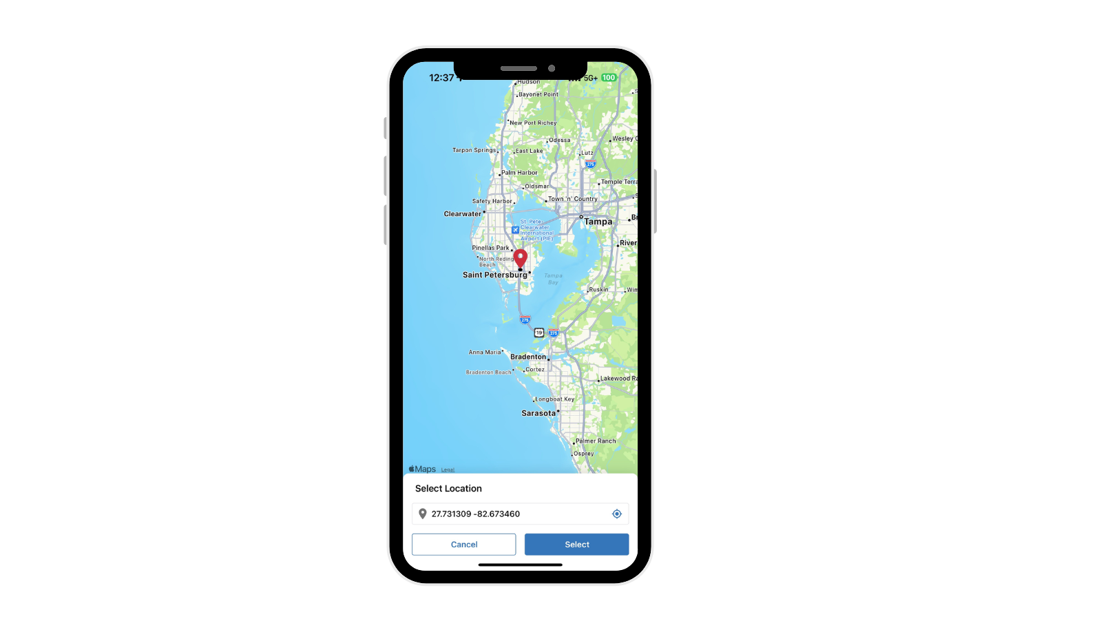
Property owners annually report data to the county, stored in a GIS geodatabase. We helped a land acquisition company upgrade this process, utilizing county property IDs. Our solution retrieves County Data, including Parcel Polygons, and integrates it into Smartsheet. This allows stakeholders to track parcels from their dashboards, ensuring all information is current and relevant.
Engineering teams, particularly in pipeline projects, can now distribute alignments through shapefiles, integrating them directly with Smartsheet. This allows for bidirectional data flow, tailored to organizational needs.
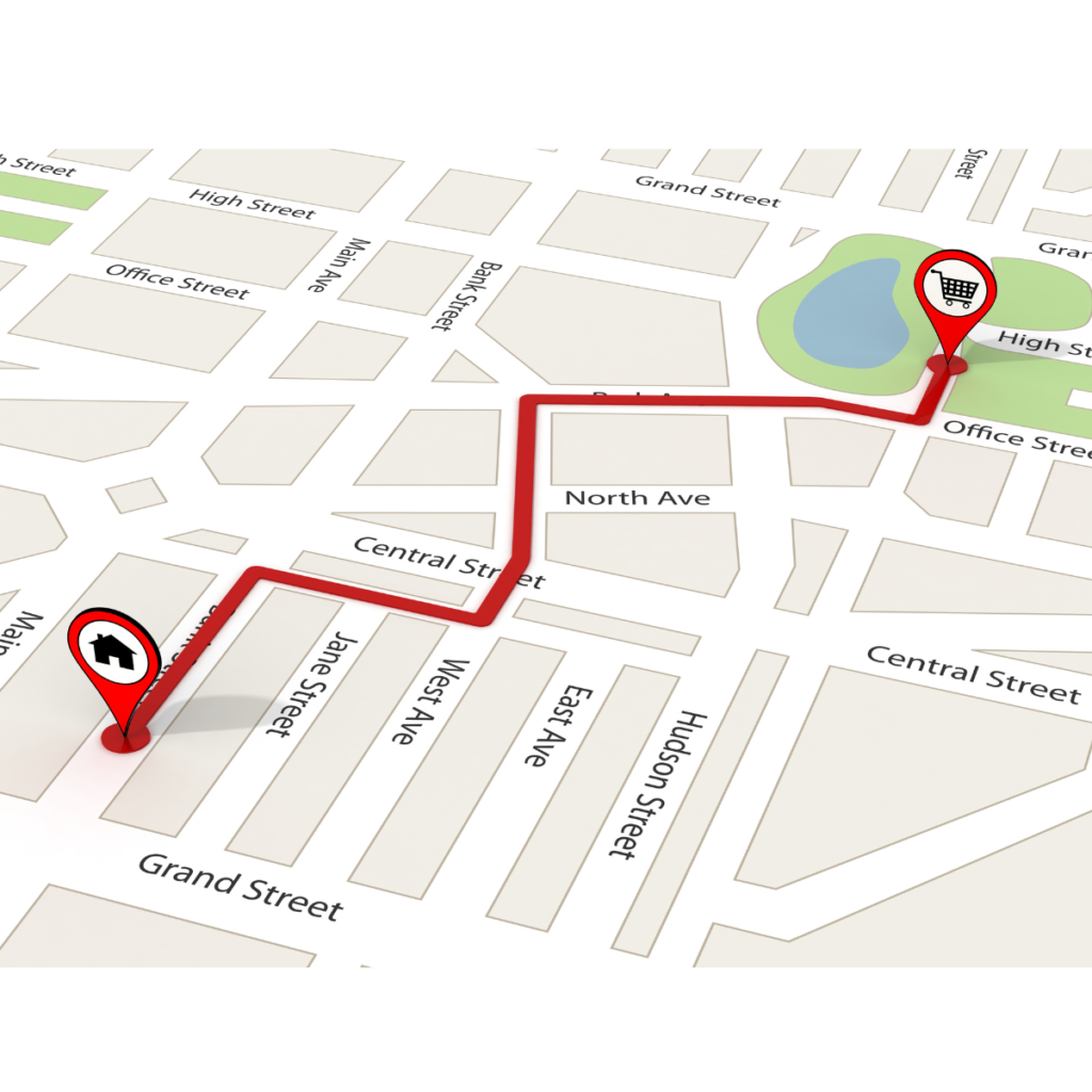
Utility companies can use this system for tracking pipeline projects. As a project manager, I’ve developed a method to estimate costs efficiently. By embedding maps into Smartsheet dashboards, costs are calculated based on the drawn asset shapes and updated in real-time.
This approach revolutionizes project management, replacing old Excel methods with more accurate, user-friendly systems. It’s about providing precise data in a familiar format, easing the transition and maximizing efficiency.